
Like children, no room is perfect but some are just so much easier. There are rooms I can envision instantly and generally their pieces fall into place and look good. Then there are the other ones. I’ve found myself so frustrated with the “problem room” while designing the kid’s room in LA as well as our living room (see only three versions above). But as I reflect on all the rooms I’ve ever done, I can now easily identify a few things that have made some rooms harder to design and make beautiful than others. These are more than “problem rooms”, they are taunting little pricks wanting to publicly embarrass you, provoke fights in your marriage due to your endless rearranging, and make you doubt your own abilities. Or so I’ve heard. So let’s identify WHY a room is hard to design so we can potentially get closer to solving these problems (if possible).
Let’s walk you through a couple of NON-problem rooms, first.

My Master Bedroom: Even though we had to put the bed in front of a window it was still an easy room to design (HOT TIP – Bedrooms are so much easier to design than living rooms mostly because there is less furniture – bed, nightstands, dresser – boom, done – and less functional needs).

Birdie’s First Bedroom: Big source of light, pretty big mural, and a big wall to either put a daybed or a bed on (see full room here). Here it was as a guest bedroom when we staged it to sell – still worked:

So why are some rooms SO hard to design? First, off I’d like to place the blame on old dead architects who built houses before the 1950s for not considering the not yet invented TV or king-sized beds, or the need for big closets and open concept kitchen/family rooms. Most modern/contemporary houses do not have the same challenges as say, a 1920s English Tudor, but they also don’t have the architectural charm (most likely). So you get one or the other. Our LA house, dripping with natural light and architectural charm was harder to figure out than the Portland project that was essentially a new build. We were able to place every window and wire for every TV. So let’s talk about the major problems and how to solve them.
Problem #1: MULTIPLE FOCAL POINTS

When you have a singular focal point it’s so easy to orient a room, but with multiple focal points and no solid walls you have more options and you have to choose what to showcase. In this living room, we have the fireplace, bay window, large french windows – it’s an embarrassment of riches in the architectural focal point arena. We’ve tried it so many different ways and this is the way the room feels the best and is the most functional for our family, but often it feels like we should be facing the fireplace and opening up those bay windows for a table and chairs. In case you never saw this layout option post when we first moved in check it out.

We recently took our reader suggestions and rearranged it even more here.
Solution: Go with function and flow (and keep all focal points visually open)
Let function and flow guide you. Like in our case, it feels like the sofa should face the fireplace. But in order for it to be close enough to feel like it was even in a “conversation” with the fireplace, it cut the room in half. While we’ve had the sofa on the other side of the room (where the french doors are) for Christmas, this is the way that works the best for our family since we do use those doors so much and I love staring into the patio from the sofa instead of facing the street.

And then just make sure that you have no furniture visually blocking a focal point – like chairs in front of your fireplace (instead try a low bench or pouf) and that is one of the reasons we are switching out our sofa – for one that has a much lower back to get those bay windows shine.
I’m so excited to show you our new sofa and the chaise lounge finally reupholstered in the most amazing floral. I haven’t seen it yet besides photos, but boy are we excited.
But the point is, I think this room is starting to really WORK, and I’m so excited to show you.
PROBLEM #2: LONG AND NARROW ROOMS

I’ll say this publicly, square rooms are easier to design. I can lay a square room in a second. Long, narrow rooms are just hard, especially if you add in doors and windows and fireplaces. Sara’s living room is such a great example of “long and narrow” done right, but it wasn’t easy.

SOLUTION: BREAK IT UP WITH ZONES
Velinda (Sara’s designer and EHD alum) broke it up into zones and used low back chairs between the zones to not visually stop the eye and yet keep it open. But this was a conundrum too and she showed up a bunch of layout options that you all voted on in this post.

To give you all a little blast from the past, here are a bunch of layouts that were put together for a “how to design a long and narrow living room” post that we did on the blog in 2016. Guys, it’s still hard four years later!

PROBLEM #3: NO CLEAR “FOCAL WALL”


Oh what I wouldn’t give for a big blank wall, maybe with two windows near each edge leaving enough room for a bed in the kid’s room (think Portland bedroom). So easy. Granted if I needed to fit one twin or even a queen bed, this wouldn’t be so hard. But since I need a king bed now and soon two twin beds it makes the layout super hard (and no, they don’t like bunk beds).
SOLUTION: CREATE A FOCAL WALL
I think maybe the I mean the word is FORCE. That’s right, force a focal wall like say, with a large visually impactful canopy. BY THE WAY, when I went down to check on the house I separated the beds and raised them and it’s starting to look good, I promise. Should I do an update post? It’s still not there, but you’ll be able to see that it is getting there. My iPhone shots just suck. Anyway, I think it’s going to work, guys. Maybe I should not have done such a loud focal wall, but she wants A LOT OF ATTENTION. You have our focus, lady.
Exhibit #2: The Downstairs Den Now Playroom

Such a good example of what NOT to do – if a room is too open with the rest of the house like our playroom/den (making it parenting a dream), don’t stop your eye by making it dark (like an “accent room”). When we realized that we needed a playroom more than a TV room, we painted it the same tone as the rest of the entry and added that ship mural which I actually LOVE. The window is still where your eye goes, but the mural helps create that “art zone”. So we GAVE it a focal point, and the windows become a beautiful source of light but you want to stay in the first 1/2 of the room because there is something exciting (yet calm) happening on that wall.

It actually really works right now functionally and makes parenting in this house easy because the playroom is so close to the kitchen. I think that if I could forego how we actually live here (aka having a kid-focused space) I’d put a pretty floating desk, with a chair and ottoman in the bay window and enclose the room with french doors, but for our life, this works so well.


PROBLEM #4: IT’S A PASS-THROUGH SPACE

What do you do when you also have to walk through one room to get to another? It’s hard. Arlyn had this problem with her dining room – she couldn’t float the table in the middle of her dining room so she came up with a genius solution – she shoved the dining room towards one wall, with a banquet instead of chairs that would need to float. SMART.

SOLUTION: Open Up and Shove Against Walls

Obviously this solution will depend on whether this room is a living room or dining, but with both of these examples, we shifted the furniture to allow the room to be more open, allowing for flow. For the family room above, by shoving the sofa against the wall, having an oval coffee table, and then choosing visually open chairs we were able to make this work. See the whole post about other ways we made it work.
PROBLEM #5: MULTIPLE FUNCTIONS
Let’s call a spade a spade – unless you have a “tv room” often the location of the TV causes PROBLEMS. Maybe you have one of those perfectly laid out living rooms where it’s not a problem, most new houses, built in the last 50 years were designed for a clear “tv wall”. In our Glendale house, there was no clear TV wall in that big bright living room, so we shoved it into the family room right off the kitchen, which was awkward but totally functional.
I just realized that this room was ALSO a pass-through room – no wonder it was so hard to make it work (I didn’t like it until the DAY we staged it to sell and then I loved it – ugh).

As you can see above, that TV was awkward just on that random wall, but it totally worked functionally for our family (it looks high but it was fine because sofa was deep and against the wall).
SOLUTION: Create Zones (Yep, Again)


This is sometimes easier said than done depending on your space, but just remember that everything looks better when it has a specific place. It will feel more organized and less chaotic.
OK, those have been my biggest struggles, but here are some other ways that a room becomes “hard” to design –
- A guest room that has to also be a TV room or an office is also hard unless it’s really big.
- Lack of natural light – A bright room with lots of windows is easier to work with. But there are ways to help, which we wrote about here.
- Long blank walls with nothing to break it up. We had that problem at the Atlanta show house, which we broke up with a big dynamic gallery wall and plug-in sconces.
- Lastly, KIDS AND PETS – There is a “price of admission” when you have either kids or pets. They’ll ruin your pretty house and furniture and they’ll create messes in every room that will then need a ton of easy access storage. It’s possible, but if you are struggling to make your living rooms look beautiful with kids and pets you are not alone. We have written about kid-friendly tips here, and pets here and both here and if you are looking for good looking storage (our favorite) check out this post here.
If you guys have any other “problem child/rooms” let us know what they are and we can try to tackle them.
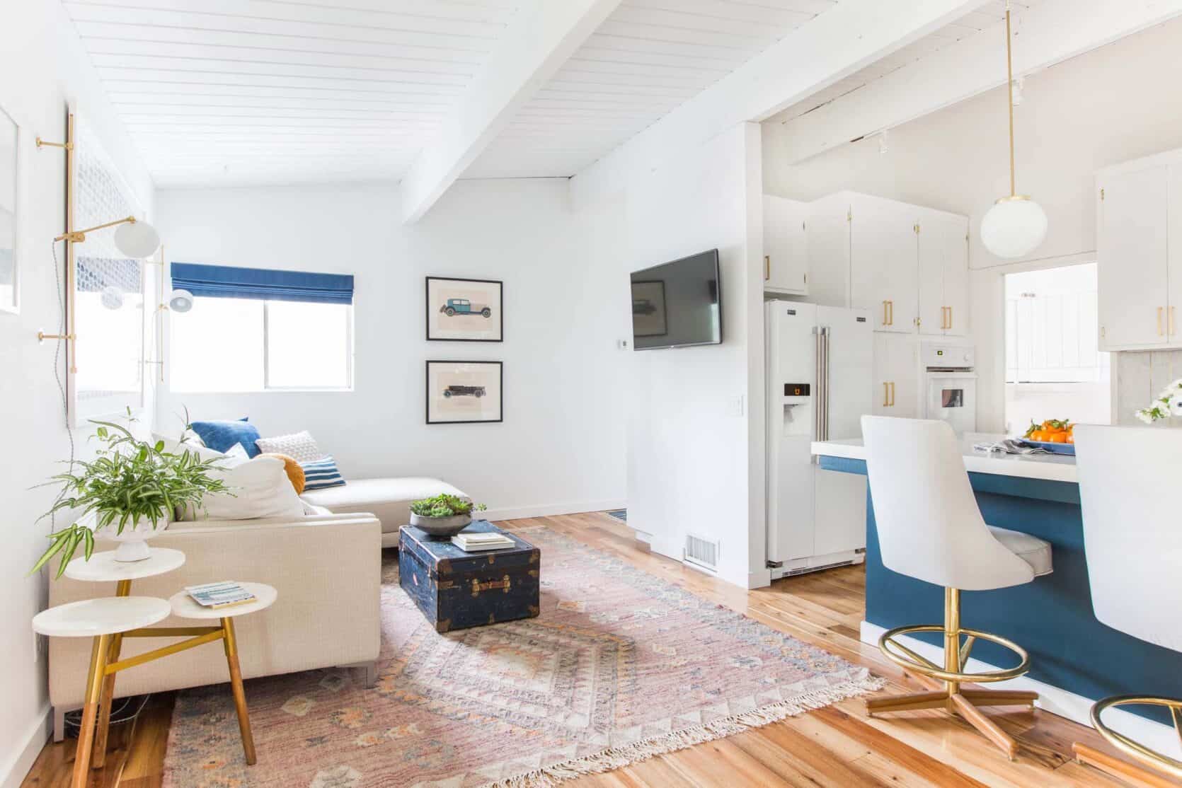
Opener Images Credits: From Left to Right: Photo by Tessa Neustadt | Photo by Ryan Liebe | Photo by Sara Ligorria-Tramp
The post Why Are Some Rooms Hard To Design and Others So Easy? A Personal Dilemma And Exploration… appeared first on Emily Henderson.
Sofa giá rẻ
https://sofagiarehcm.hatenablog.com
0975488488
981 Huỳnh Tấn Phát, P. Phú Thuận, Quận 7, TP Hồ Chí Minh
Sofa giá rẻ
Không có nhận xét nào:
Đăng nhận xét